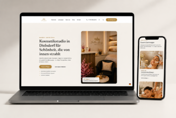
Landing pages
One page for one campaign, with one action to take. I remove the menu and everything else that gives a visitor a reason to leave, then measure the page against what each lead costs you.
What’s included
A plain list of what the project involves, so you can see where the time and money go.
Every section moves the reader toward the same action. I remove distractions on purpose, including the main navigation.
Promise, proof, objection, answer, action, in the order people think and not the order the org chart suggests.
You pay for every click, and a slow page charges you twice. These pages are built to load before the visitor reconsiders.
The shortest form the offer can justify, validated as people type, with errors that say what to do.
Conversion events, UTM capture and lead source recorded, so you can tell which campaign paid for itself.
Built so a headline, an image or the order of sections can change and be re-measured within the week.
Process
What you’re promising, to whom, and why they should believe it. A weak offer can’t be rescued by layout.
Structure and copy direction first. On a landing page the words are the design.
Designed and built as one page, then tested on a real phone on a real network.
Live with tracking on. Then change one thing at a time and watch what it does.
The difference
| The usual | This way | |
|---|---|---|
| Goal | Several, competing | Exactly one |
| Navigation | Full menu, many exits | Removed on purpose |
| Message | General | Matched to the ad |
| Form | Generic contact | Built for the offer |
| Measurement | Page views | Cost per lead |
Questions
A landing page has no navigation, one call to action and copy that matches the ad that brought the visitor. A homepage has to serve everyone. A landing page serves one person with one intention.
For landing pages, usually yes. The argument and the layout are one decision here, and splitting them between two people rarely works.
Yes. Variants of headline, hero or section order, with tracking set up so you’re comparing numbers.
It uses the same design system, so it feels like you, minus everything that would give the visitor somewhere else to go.
The offer, the audience and whatever proof you have: numbers, testimonials, guarantees, credentials. The stronger the proof, the shorter the page can be.
Also available
Next step
Two or three lines about the business and the goal are enough to start. I reply within one business day.